Product Engineering
UI UX Design for Enterprise Applications: A Guide
Affix Center · · 6 min read
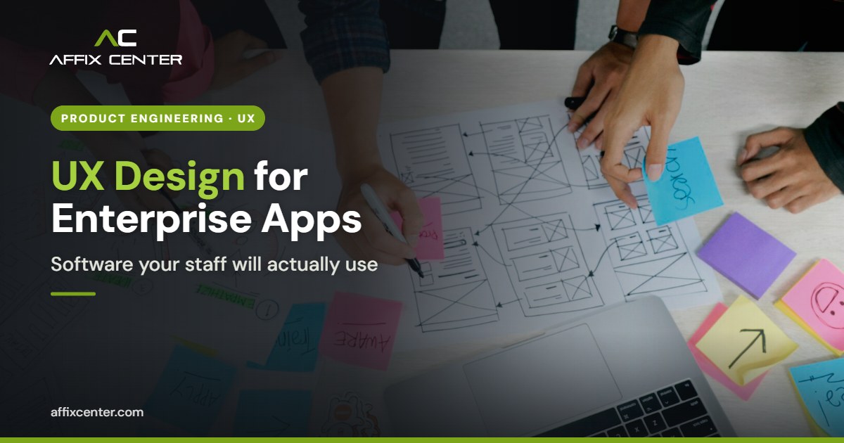
An enterprise application can have every feature in the specification and still fail. Staff keep using Excel on the side, data entry takes twice as long as planned, and the helpdesk fills up with "how do I" questions. In most cases the root cause is the same: nobody designed the software around how people actually work. Good UI UX design for enterprise applications is what closes that gap.
Consumer apps get a lot of design attention. Internal systems such as ERP screens, HRMS portals, case management tools and departmental MIS rarely do. Yet these are the tools that clerks, supervisors and field officers use for six or eight hours a day. Small design problems multiply into lost hours, errors and frustration. This guide sets out a practical approach that works for Indian enterprises, PSUs and government departments.
Why Enterprise UX Is Different from Consumer UX
The principles of good design are the same, but the context is not. Enterprise users do not choose the software. They are told to use it. They often perform the same task hundreds of times a day, and speed matters more than visual appeal.
- Complex workflows. A single process may pass through a clerk, a section officer and an approving authority, each with different screens and permissions.
- Dense data. Users need to see many fields, records and statuses at once without scrolling endlessly.
- Mixed skill levels. The same system may be used by a finance head in Mumbai and a data entry operator in a district office with limited training.
- Language needs. In Maharashtra, many users are more comfortable with Marathi labels and help text than with English.
- Long life. Enterprise software stays in use for years, so design choices must scale as modules are added.
Start with Research, Not Screens
The biggest mistake is to jump straight into mock-ups based on a requirements document. Requirements describe what the system must do. They rarely describe how people do the work today, where they get stuck, or what workarounds they use.
A short research phase pays for itself many times over:
- Observe real users. Sit with staff for a few hours at their desks. Note how often they switch between systems, what they copy and paste, and what they keep on paper.
- Map the current process. Draw the steps, hand-offs and approvals. Mark the delays and repeated data entry.
- Identify user roles. List each type of user, their main tasks and how often they perform them.
- Collect pain points. Ask users what slows them down. They usually know exactly what is wrong.
- Agree on success measures. For example: time to process one application, number of errors per hundred entries, or training hours needed for a new joiner.
This groundwork often reveals that part of the problem is the process itself, not the software. That is where an enterprise advisory view helps, so you simplify the workflow before you digitise it.
UI UX Design Principles for Enterprise Applications
Once you understand the users and the work, apply a few principles consistently. They are simple, but they make the difference between software that people tolerate and software that helps them.
Design for the most frequent task
Find the two or three tasks users perform most often and make them fast. A dispatch clerk who creates eighty entries a day needs keyboard shortcuts, sensible defaults and no unnecessary confirmation pop-ups.
Keep forms short and logical
Group related fields. Show only what is needed for the current step. Use drop-downs and auto-fill where values are known, such as a PIN code filling in the district. Validate data as the user types, with clear messages in plain language.
Make status visible
Users should always know where a record stands: draft, submitted, pending approval, returned or closed. Clear status labels and a simple history trail reduce follow-up calls and emails.
Build dashboards around decisions
A dashboard should answer questions, not just display charts. Ask each role what they need to decide each morning, and design around that. A supervisor may need pending items by age, while a department head needs trends and exceptions.
Stay consistent
Use the same button positions, colours, date formats and terms across every module. A shared design system, with reusable components and rules, keeps a growing application consistent as different teams add features.
Accessibility and Language
Accessibility is not optional for public-facing or government systems. Government websites and applications in India are expected to follow the Guidelines for Indian Government Websites and Apps, and the current version, GIGW 3.0, is aligned with WCAG 2.1 Level AA. Internal enterprise tools benefit from the same practices.
Practical steps include:
- Sufficient colour contrast and text that can be resized without breaking the layout
- Full keyboard navigation and visible focus indicators
- Labels on every form field that screen readers can announce
- Error messages that explain what went wrong and how to fix it
- Support for Marathi, Hindi or other regional languages where your users need them, with fonts that render correctly
Designing for accessibility usually makes the software easier for everyone, including users on small screens or slow connections.
Prototype, Test and Iterate
Enterprise teams often skip usability testing because the users are "internal" and can be trained. Training is expensive, and it does not fix a confusing screen. A better approach is to test early with clickable prototypes.
- Build low-fidelity wireframes for the key workflows and review them with a few real users.
- Create a clickable prototype of the most important journeys.
- Run task-based tests. Ask five or six users to complete real tasks while you watch. Do not help them. Note where they hesitate or make mistakes.
- Fix and repeat. Update the design and test again before development starts.
- Measure after launch. Track task times, error rates and support tickets, and plan design improvements in each release.
Changing a prototype takes hours. Changing a built and deployed module takes weeks. This is the single strongest argument for investing in UI UX design for enterprise applications before development begins.
Common Mistakes to Avoid
- Copying paper forms field by field onto the screen instead of rethinking the flow
- Showing every option to every user instead of tailoring screens by role
- Designing only for large desktop monitors when many users work on laptops or tablets
- Treating design as decoration added at the end rather than part of requirements
- Ignoring feedback after go-live because the project is "closed"
Frequently Asked Questions
What is the difference between UI and UX?
UI is the visual layer: layouts, buttons, colours and typography. UX is the whole experience of completing a task, including flow, speed, clarity and how errors are handled.
Do internal enterprise tools really need UX design?
Yes. Staff use these tools for hours every day. Poor design leads to errors, slow processing, extra training and low adoption, which all cost money.
How long does enterprise UX design take?
It depends on the number of modules, user roles and workflows. A focused research and prototyping phase for core journeys usually runs alongside early requirement work.
Which accessibility standard applies to government applications in India?
Government websites and apps are expected to follow GIGW 3.0, which is aligned with WCAG 2.1 Level AA.
How Affix Center Can Help
Affix Center helps government departments, PSUs and enterprises design and build applications that staff and citizens find easy to use. Our product engineering team can run user research, map workflows, build prototypes and carry the design through to development and testing.
If your team is planning a new enterprise application or struggling with low adoption of an existing one, get in touch with us to discuss a practical UX review.